Bringing new life to the blue icon
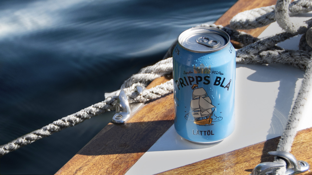
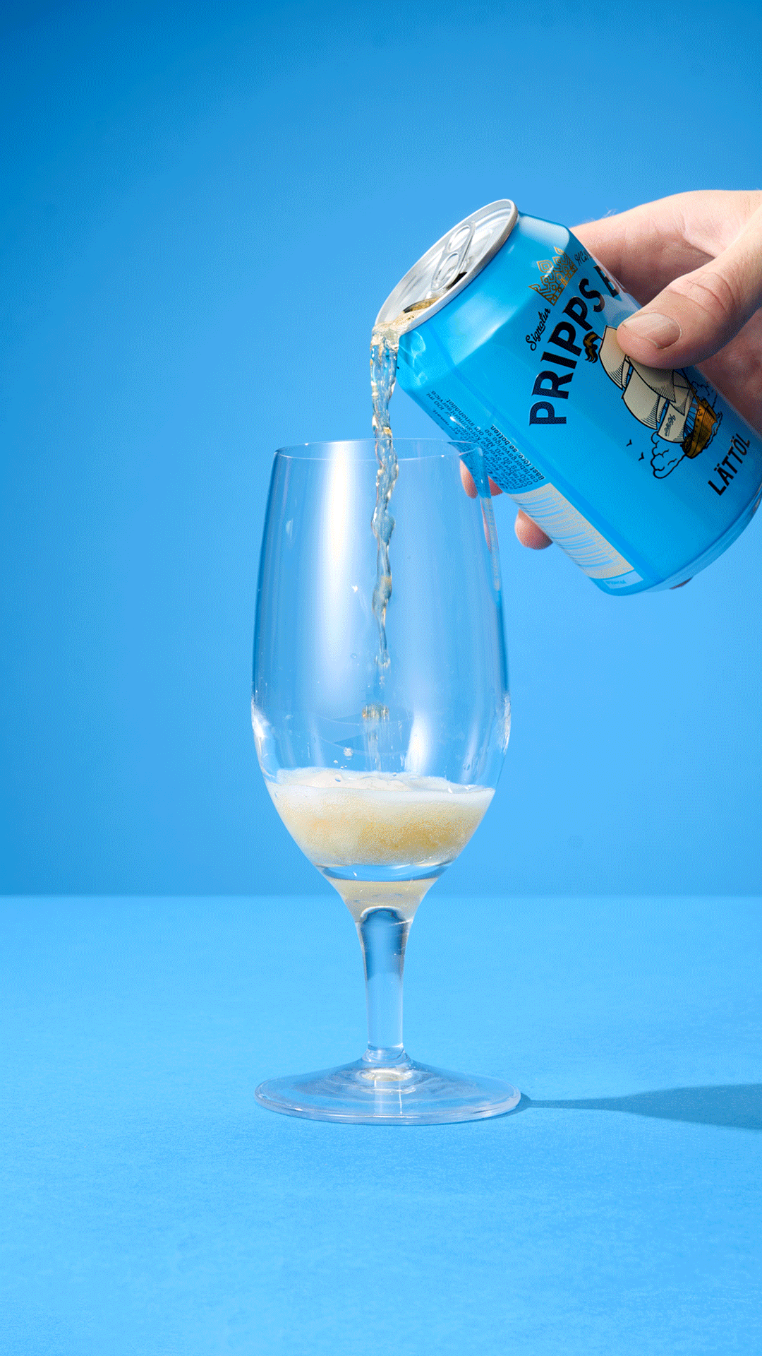
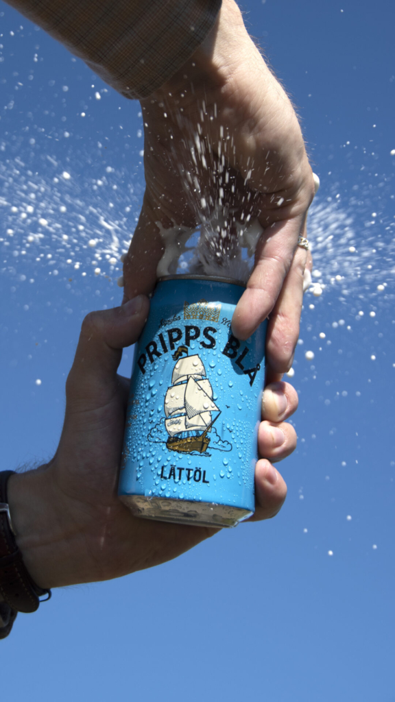
Pripps Blå pale lager is a classic Swedish beer that has been around since 1959. For many, the product is deeply rooted in the Swedish soul. A blue can in every hand, a thirst quencher for bright summer nights, friendship, camping and romance in the archipelago.
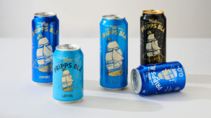
Grow was approached to create a new packaging design for Pripps Blå, helping the brand stand out in what has become a crowded marketplace. Facing increased competition from mainstream brands as well as a growing craft beer segment. Part of the brief was also to retain senior loyal consumers while attracting a younger generation.
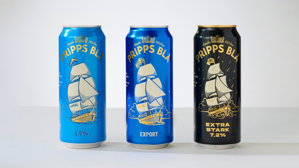
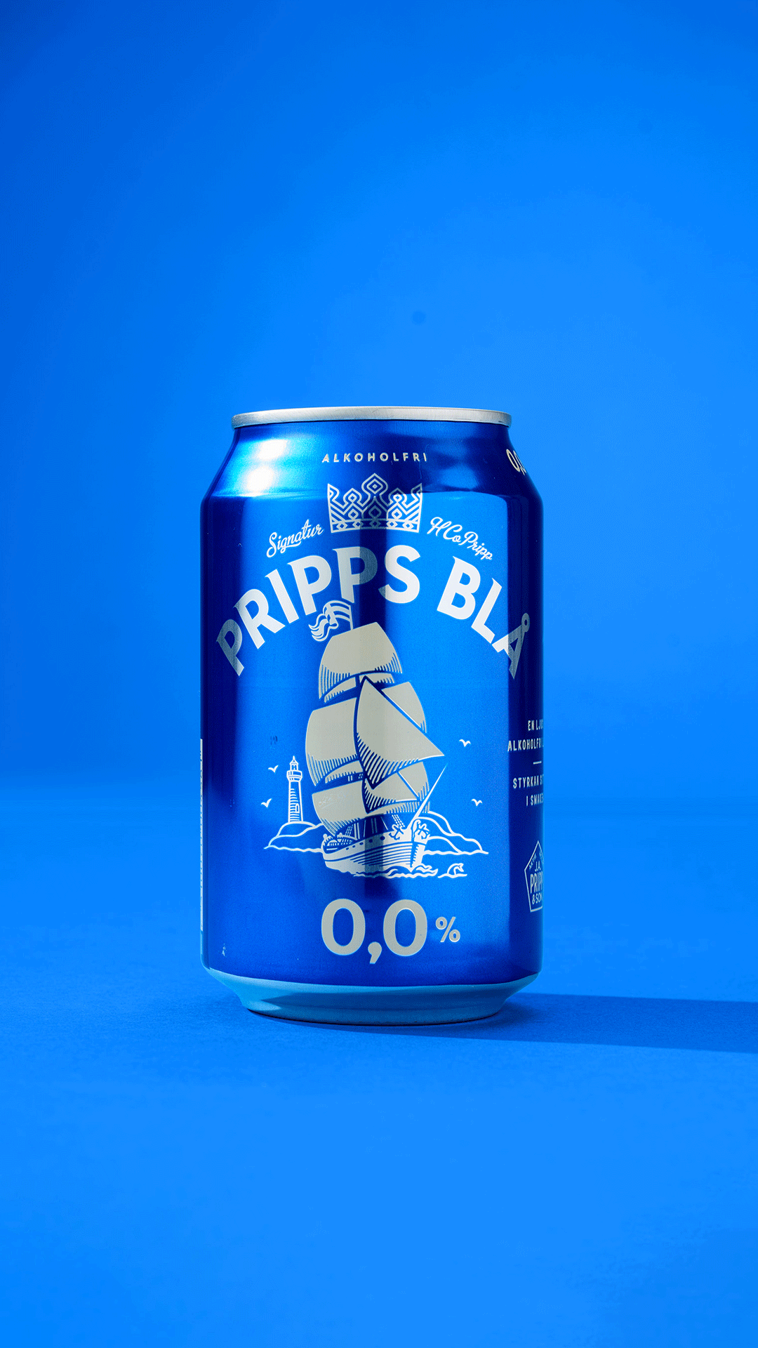
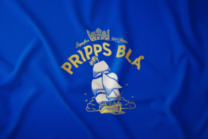
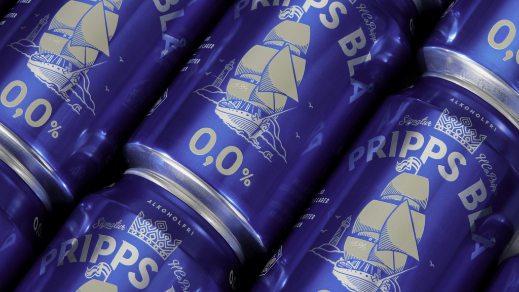
The blue colour has become an iconic identifier for the beer and if we go back in history, the brand was first called Pripps Export. Receiving its nickname after all blue cans that were left on the lawns in Swedish parks, a phenomenon referred to as blåsippor (Hepaticas).
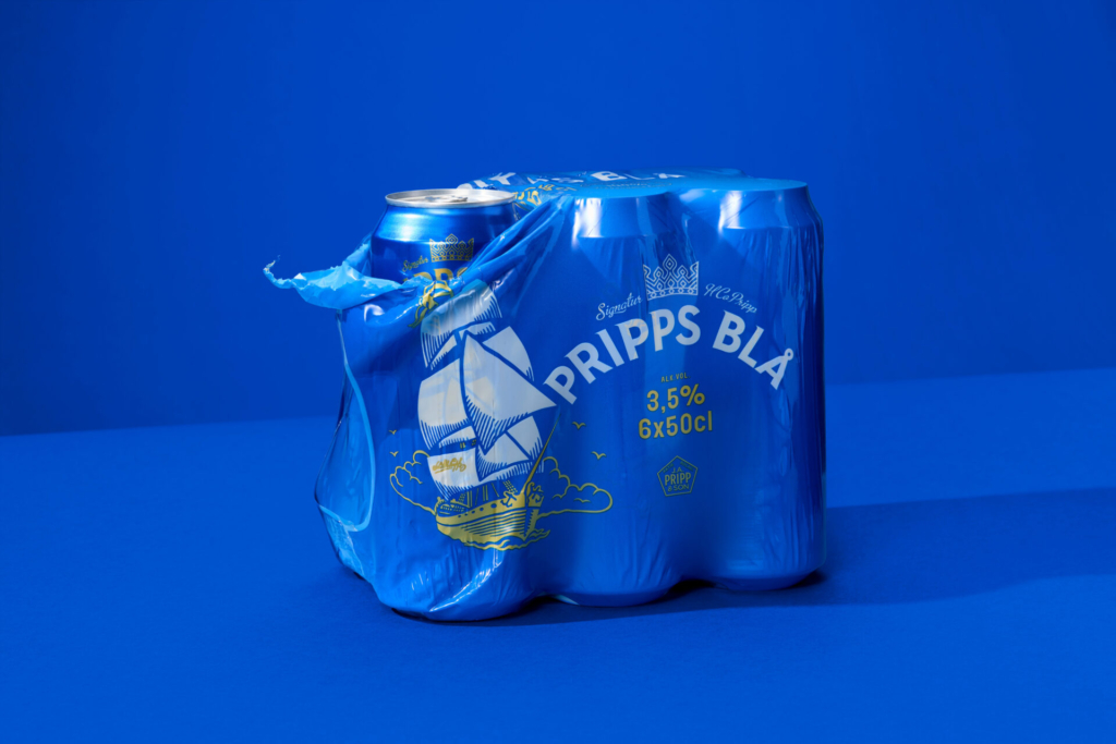
In addition to the blue colour, the iconic ship was kept and elaborated as it carries the heritage and strong recognition of the beer, representing freedom and escapism. To gain shelf impact, and to refresh the brand experience, the design was stripped down to its core elements. Resulting in a classic beer packaging design, now dressed in a modern suit.